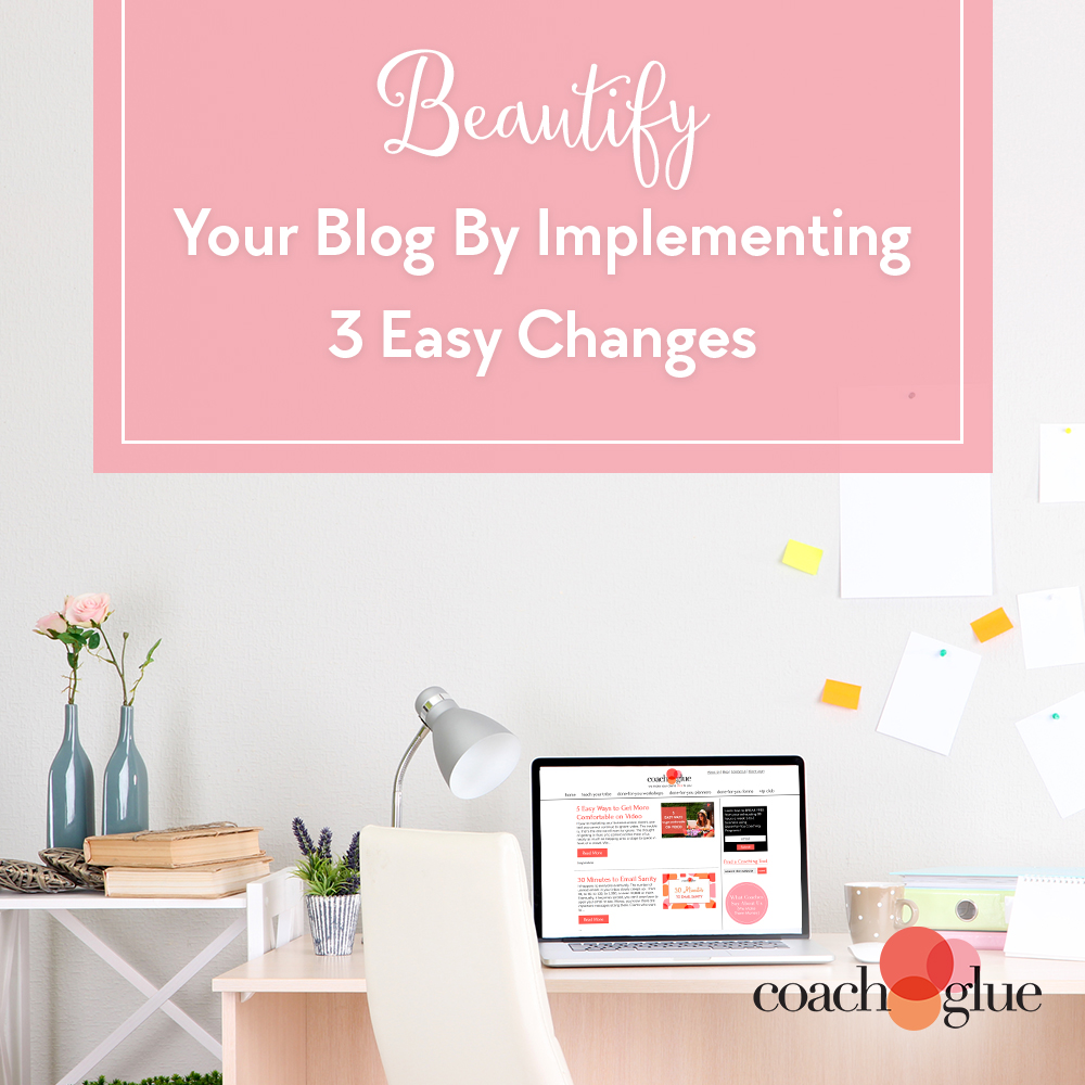
We all like to think that looks don’t matter, but when it comes to your blog or website, they definitely do.
Outdated, unattractive websites can:
- Make readers question your authority. After all, if your blog looks out of date, it probably is
- Turn off potential affiliates and JVs
- Put a crimp in your social sharing power
But just because your blog might be a little outdated, it doesn’t mean you have to spring for a brand new high-end design. In fact, a few hours spent updating your most important elements can have an amazing effect—much like how a fresh coat of paint will instantly spruce up that outdated kitchen.
Fonts and Colors
Consistency is key here. If you don’t yet have a brand standards guide, it’s time to implement one. A written guide will help ensure everyone on your team knows exactly which fonts to use both on your blog and in your graphics, which colors to use where, and what size and color text to use for headings, quotes and other elements.
Be sure you (or your designer) clearly define your primary font and color as well as secondary fonts and colors, and remember to carry your branding to all channels: blog, website, social media, email and anywhere else your company is represented.
Your Logo
Many coaches (and plenty of other online business owners) get started by bootstrapping everything, including logo design. If you are still using that logo you created yourself in PowerPoint, it might be time for an upgrade.
You can keep the same colors and overall look if you like, but a trained logo designer will be able to craft a professional, elegant look that resonates with your audience.
Blog Post Graphics
Your post graphics serve several purposes:
- Visual interest to capture attention
- Sharing information in a non-verbal method
- Breaking up large blocks of text to make it easer to read
And perhaps most important in today’s social-media obsessed world: For sharing on Pinterest, Facebook, and other platforms.
Without relevant, colorful, eye-catching graphics, your blog posts might not attract the attention or gain the traction they otherwise would. Be sure your images are on brand, consistent in size and layout, and visually attractive across a variety of platforms.
These three simple changes can make all the difference when it comes to taking your blog from blah to beautiful, and help attract the readership and following you deserve.
Could your blog use a makeover?
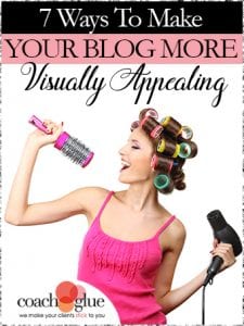 If your blog (or your clients’) could use a makeover, don’t be too quick to hire a designer. Discover how easy it can be to make your blog stand out from the crowd with our brand new Teach Your Tribe Kit, 7 Ways to Make Your Blog More Visually Appealing.
We’ve done all the research and hard work, so all you have to do is add your branding and voice, and you’ll instantly have an in-depth training program (including slide deck and checklists) to help your clients, or a how-to you can use to improve your own site.
